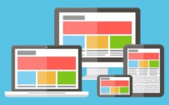
 What makes visitors stay on your site for longer? It is a good Web design with pleasing functionality. If you put in lots of considerations to provide for a great online experience for your visitors, they will definitely hang around on your site for longer than they would otherwise. Whether it is the appearance, page speed, navigation or clarity, it all decides upon the visitors’ stay on your site. You definitely do not want visitors who land on your site to quickly click the back button, do you? For this, you need to make your website create a beautiful first impression on the visitors. It is only the first few seconds that will have visitors deciding upon whether they wish to browse through your site further or not. To avoid having them bounce back almost instantly, make sure not to make any of the below mentioned mistakes while building your site. Or, you can hire the most professional Web designers in Bangalore who will take care of all of this and more on their own, without you having to worry about anything.
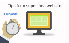
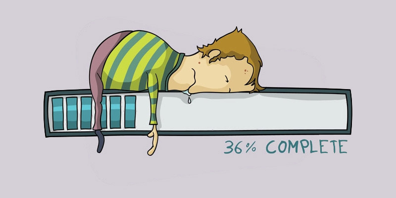
Slow loading
People don’t have time to waste today. They are finding ways to get information as fast as they can. They wait no more than 3-5 seconds for a page to load, failing which they instantly bounce back. And if your site takes too long to load, you know that the same is going to happen to you too. All your efforts and resources put into building your beautiful site is a waste. Even a few seconds delay can incredibly increase your bounce rates. Therefore, you must take steps to improve your site’s performance and speed by using caching plugins to optimize images and remove irrelevant elements.
Poor readability
You put in all efforts to have the most beautiful and informative content on your site. But, what value does it provide if it is unreadable? You need to provide clearly written text that is easily readable by one and all. You may use fancy fonts or contrasting coloured text thinking that it will add to the beauty of your site. But, these fancy fonts and contrasting colours may make it difficult to read too. It is advisable to use a simple basic font type and a decent font size to allow for better readability. Also, avoid contrasting colours. If you have long form text, make it interesting to read by using paragraphs, headings, bullet points and relevant images, or your long form content may seem quite boring and unattractive to the readers.
Lots of clutter
You may want to provide lots of information, images, guides and all sorts of other stuff to your readers to help prove beneficial to them. But remember, adding too much on a page only seems to be clutter, which can turn off the visitors. Have you seen how one of the largest search engine – Google – has such simple pages with so much of white space? You need adequate amount of white space between different elements to make the page look neat, and also to separate different elements. White space leads to improved readability, easy navigation and higher conversions too.
Poor navigation
Navigation on your site should be easy and convenient for the users. If visitors cannot find a page easily and quickly, they will more likely be bouncing out of your site, which may result in them landing on your competitor’s site. Place a navigation bar at the top or at the left side of your site. Provide categories and sub-categories clearly within the navigation bar so that visitors can easily find the information they are looking for. But, make sure that every page on your site can be found in not more than three clicks, or it will get the users restless and annoyed.