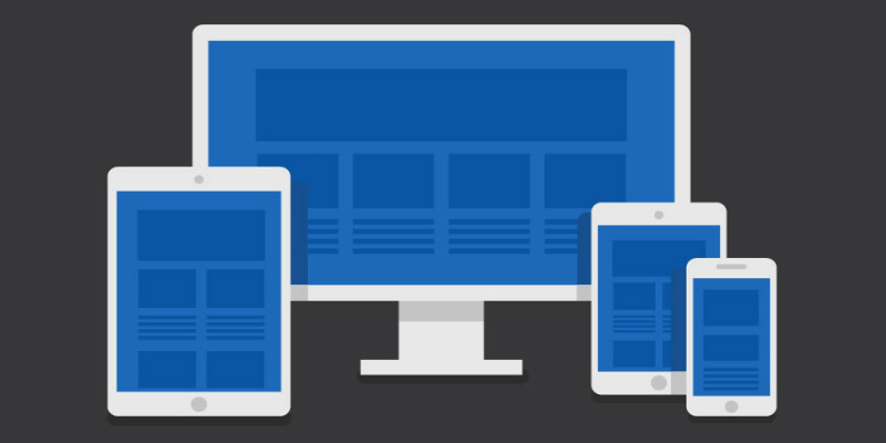
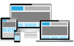
 Accessible websites are those that are built to support all browser types and for those users with disabilities like visual impairments, difficulty/inability to use hands, hearing impairments, intellectual disabilities and more. Responsive websites are those that provide the finest viewing experience across a wide range of devices, requiring a minimum of resizing, panning and scrolling. And, when these two qualities need to be combined together into one, designing gets quite difficult because there are lots of requirements to be considered to accomplish lots of goals differently for both of them. However, if you follow this guide, it will become much easier for you.
What are the goals of responsive website design?
The main aim of responsive website design is to provide usability regardless of the size and resolution of the screen it is being viewed on. It is advisable to start with mobile screen size and resolution first, and then move up to bigger desktop sizes. You might be considering a whole lot of things like – should the mobile layout have larger text size, or should the buttons be large enough to tap, etc. Some of the most important things you need to consider include the typography, white space, easy navigation, and columns and grids.
What are the goals of accessible website design?
Designing for accessibility includes different features and considerations. These include alt tags on images for screen readers, colour contrast for users with vision impairment, etc. So, before designing for accessibility, you need to determine what type of accessibility problems you are willing to support. One example may be providing keyboard shortcuts for those users who don’t use a mouse. Another may be providing tappable or swipeable elements for users who use small touch screen devices.
What elements need to be considered?
Touch supporting elements
It isn’t a hidden fact that people are highly using their touchscreen devices for browsing the Internet. Thus, touch supported UI is one of the most important factors that your website needs to fulfill today. All elements on your site should be touchable or swipeable. Some elements that should support touch input on your site include slideshows, video players, lightboxes and dropdown navigation.
Navigation
Navigation in any case should be as simple as possible. Whether using a desktop or mobile or any other device, navigation should be very convenient for the users so that they can surf thoroughly through the page at ease. Although multi-level dropdowns are great but, they are not always the best. You may also opt for top navigation for major sections with some sections including sidebar navigation for further categories. Other options are sliding navigation, skip to navigation link, and scroll to top link.
Content arrangement
You need to arrange your content in a way that it gives visitors a quick way to browse the site by leaving room for lots of text with line height and big margins. The text should also be contrasting from the background so that it is easy to read even from a distance.
Although this guide has not covered all the topics around accessible and responsive website design because the field is huge but, hopefully this guide proves to be helpful to you. It covers the major requirements of both responsiveness and accessibility, and explains how they both work together to improve usability. Although both the topics are not directly related but, they create a pleasant UI with great functionality when combined together.

