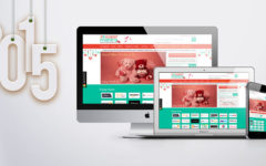
 A website should always be neat and clean, appealing to the eyes. Too much of text combined with lots of images and animations only makes the website cluttered, even if all of the elements provided are informative. This in turn displeases the users and they are tempted to leave the site. You need to have a decluttered website if you want great user experience on your site. Here is how you can do so.
Have minimal embellishment
You would wish to show your visitors how much creative talent you have, and in the process you will put up more on your website than you actually need. You will try to add all sorts of relevant images, animations, and pretty decorations to make your design look good. However, using that in excess amounts, or without the right execution, it will prove to be a disappointment for the visitors. Even if you have the best content, it will be of no use if your embellishments come in the way, or if they are too distracting. You must hire a professional web designing company in Bangalore, who knows just the right amount of elements required on a page, and also has great talent in executing all of it in the best way possible.
Optimize your content
When users land on a page, they don’t just start reading everything word to word. What they first do is scan the page to get an idea whether they like it or not. If your content is in the long-form without any breaks, subtitles, or bullets, it is going to bore the users. It is better to have a readable amount of text on a page that has all the information appropriately placed in the right amount of words. Avoid any unnecessary words that add no value but only increase the length of the content needlessly. Also, keep the length of your sentences short. Have only one idea per paragraph.
Maintain consistency
Remember that consistency makes a clear design. If you use too many font styles, sizes and colour variations, you will only make your page look messy. Keep things consistent on a page and don’t use more than 2 to 3 font styles and sizes. It is good to add colour to your page but making it too colourful will only make your website look childish, and not professional.
Look from a user’s perspective
Who are you designing your website for? Is it for you? No. It is obviously for your users. So, instead of putting in what you like, you need to put up what they would like to see. And for that, you need to understand the purpose and goal of your target visitors who will land on your site. Ask yourself why they would come to your site and what they would expect from you. Frame the goal from a user’s perspective, and not yours. Have a clear goal, and accordingly design your forms, CTA buttons, and other elements. Keep it minimal and remove everything that does not help the users.