
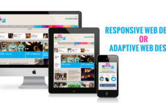
Responsiveness stands at the top of the list when it comes to Web design. Because people are using all sorts of devices and platforms to surf the Web, website owners and designers are creating more and more of responsive Web design to cater to maximum number of people. However, you need to follow the right practices for designing a responsive website, or else you will not get the desired results. Many websites are seen to be making clear mistakes on their site. The most common mistakes widely seen across websites have been mentioned below. Go through the list to make sure you are not committing any of them. And, if you still don’t have a responsive website, it’s high time you get in touch with professional Web designers in Bangalore who are well-versed with every design element and practice, and will make sure not to commit any of these mistakes.
Catering only to smartphone and tablets
Many website owners only focus their website on smartphone and tablet screen sizes as they know they can gain maximum traffic from these devices. There isn’t a doubt that majority of traffic comes in from these devices, but this doesn’t mean desktops and laptops are no longer being used. In fact, almost 40% of traffic still comes from desktops today. Moreover, with the amazing technology coming up, people are also incorporating the internet into their televisions and home theatre systems, and you very well know how large these screen sizes can be!
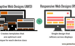
Focusing on devices, and not on screen size
With smartphones becoming more of a necessity than a luxury today, mobile companies are coming up with new models every day. As per a survey, there are more than 24,000 Android phone models that customers can choose from! Apart from these mobiles and tablets, there are many other devices like desktops, laptops and wearables that people use to surf the Web. Moreover, new devices with new display sizes will always be coming up in the market. Therefore, it is advisable to focus on screen size rather than on the various types of devices. Designing for small screen, mid-sized screen, large screen and extra large screen makes more sense than designing for thousands of devices, doesn’t it?
Cutting off content for mobiles
There is a practice of cutting down and hiding some content parts for mobile devices as the website owners want to fit their content into the small screen while highlighting only on the most important points. But, when these mobile users browse through the same website on desktop, they are annoyed to see that there is more content to the site than they thought. To avoid this kind of annoyance, make sure you keep the content same on both mobile and desktop.
Keeping the same format on both small and big screens
Although it is advised to keep the content same for both mobile and desktop, it isn’t necessary to stick to the same layout and navigation too. Different types of devices require different navigation patterns. Keeping the colours, typefaces, content and links the same, you need to alter the visual layout, button sizes and navigation pattern according to screen size to make it easy for the visitors to browse through your site on any kind of device.
Linking with non-responsive websites
Linking to other websites for further information and a better user experience is a great idea, but there is an important consideration here too. Yours is a responsive site, but is the website you are linking too also responsive? This is an important question to be considered. If you link your responsive site to a non-responsive site, you will definitely annoy a huge number of visitors and thus, lose out on even the potential ones.
Check for any of these mistakes and take steps to get rid of them immediately. You can hire expert and experienced Web designers in Bangalore to take up the responsibility of the task in the most professional way. Also, make sure to test your website on different devices before making it public so that you can fix user experience issues, if any.
