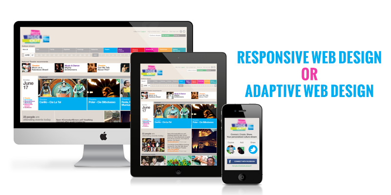
One of the very common questions that is asked by website owners is whether they should opt for a responsive or adaptive web design so that they can provide an optimum user experience across all devices that their website is viewed on. If you are also in the same confusion and don’t know where to go, this article may help clear all your doubts. The first and foremost thing we will discuss is what responsive and adaptive designs are. Next, we will discuss about their differences, and benefits and disadvantages of each one.
What is responsive web design?
Responsive web design is one that is crafted to provide an optimal viewing experience with easy reading and navigation to users viewing the website across a wide range of devices, with a minimum of resizing, panning and scrolling. This is achieved by using fluid grids. Thus, no matter what the screen size is, the same layout will automatically respond to that size appropriately.
What is adaptive web design?
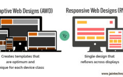
Adaptive web design is also crafted for a single website to be shown on different screen sizes. But here, there isn’t only a single layout; there are several distinct layouts created for multiple screen sizes. All the created layouts are on standby until a visitor visits the site. The website then detects the type of device used and its screen size, and then delivers the most appropriate layout out of the many options available.
What are the pros and cons of each type of design?
- Responsive web design very easily adapts to the size of the screen by making use of any one of the dimensions of the screen, may it be the height or width or display type. Thus, responsive designs are fluid and smoothly adjust between screen sizes just like slowly pouring a cup of water into another. On the other hand, adaptive designs ‘snap’ into place to adjust between screens.
- Responsive designs require only a single layout to be viewed appropriately on any and every screen size. While, for adaptive designs, you will need to have pre-constructed layouts for different types of screen widths like 320, 480, 760, 960, 1200 and 1600. And then, if a new width size comes into the market, you will have a site that inappropriately fits because you wouldn’t have a pre-defined layout for it, so it will use the most closely adaptable layout.
- Because responsive designs have only a single layout, they load almost immediately. Conversely, in adaptive designs, the process of loading all the extra layouts to be able to ‘detect’ the most suitable layout takes a lot of time.
After going through the points above, you would say that responsive design is a better bet. This is the reason why a large number of websites use responsive web design today. Also, it is very easy to build and maintain such designs. These designs are also pocket-friendly because you pay for only a single layout.
But, what about adaptive web designs? Where can they be useful? These designs are can be used when you already have a website, and you want to build a mobile-friendly version of your site. While starting from scratch, you can use this type of design by beginning with the lowest resolution viewport and then working your way upward.

